When communicating the science of climate change, it can be hard to understand all the concepts and impacts in just words. Infographics are extremely helpful to visualize these circumstances while learning about climate change. Let’s look at infographics from 5 organizations to see if they did a GREAT, GOOD, or OKAY job at conveying their message. Then, we’ll analyze the infographic through a PR lens, and provide recommendations for the organizations.
- OKAY
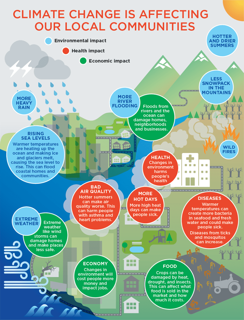
- King County, WA has lots of eye-catching images and lots of information.
- However, there aren’t any statistics to back up the information and there is an unclear call to action for King County residents.
- From a PR standpoint: It is good that King County cares about its residents and wants to provide easily digestible information to them, but it is unclear what the residents are supposed to do after reading the infographic. The infographic does not succeed in PR if it does not persuade its audience to change their attitudes and behaviors.
- Recommendations: King County needs to update this infographic with a clear call to action for its residents, preferably as the title of the infographic so the reader knows what they need to do right away. Additionally, they need to cite statistics that prove the statements made.
2. NASA

- GOOD
- NASA provides a variety of information and images that are backed up by statistics. It is also unique that they included a quote.
- Surprisingly, NASA did not cite where they got the information from, except in the quote.
- From a PR standpoint: It is smart that NASA talks about climate change, since they not only research the universe, but Earth as well. Having infographics such as this one demonstrate that NASA not only cares about other planets, but ours as well.
- Recommendations: NASA needs to add a call to action, preferably at the top of the visual to make it clear to the readers what they should do after reading. They also need to cite their sources.
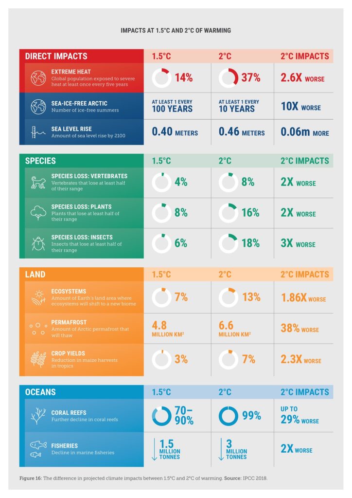
- GOOD
- Climate Council includes LOTS of organized information and statistics. They cited their source at the bottom of the visual.
- However, the title is very small and there is an unclear call to action.
- From a PR standpoint: It is smart and strategic for Climate Council to have infographics and other resources on their website for people to use. When these resources are shown to other audiences, they may look into what the Climate Council is, what they do, etc. In a way, providing these resources is like a form of exposure.
- Recommendations: Climate Council needs to make their title bigger and more eye-catching. They also need to provide a call to action for their readers.
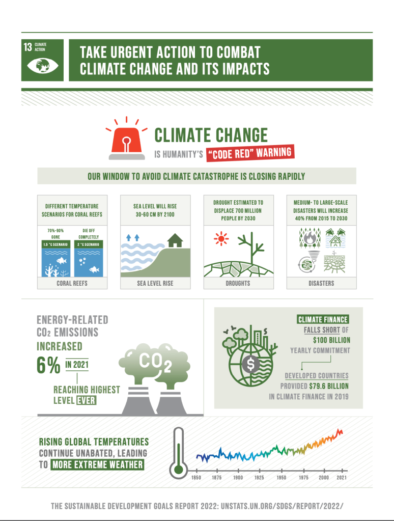
- GREAT
- The United Nations provided lots of organized information and statistics. They have a clear title that is large and serves as a call to action for readers and they cite their source. Overall, this infographic is persuasive, and informative, and makes you want to take action.
- From a PR standpoint: It is smart and strategic for the UN to provide infographics and resources on their website. Furthermore, this infographic proves that they put their mission statement, “Peace, dignity and equality on a healthy planet,” into action.
- Recommendations: While the infographic is successful, it is hard to find on the UN’s website. The UN should make these resources more accessible so more people can use, share, and distribute them.
5. American Public Health Association

- OKAY
- There are lots of scenarios related to climate change and a variety of information.
- However, there are no statistics and the sources are not cited. Although there is a large title, there is an unclear call to action.
- APHA also has separate infographics with each scenario with the statistics and cited sources, so it’s odd that this graphic, almost like a summary, does not have these details.
- From a PR standpoint: It is smart for the APHA to have these resources since climate change has environmental and health impacts.
- Recommendations: APHA should reconfigure this graphic to include their missing statistics and sources. They need to include a call to action.
Many infographics have connections to climate change, and though there may be issues with some of them, one thing is clear– climate change is a pressing issue that we should be concerned about.

Leave a comment